WHAT
IT'S ALL
ABOUT?
VIRTUAL REALITY &
INFORMATIONDESIGN
“Campus Bachelor” is the name of my bachelor‘s thesis in media design, or more precisely, information design. Everyday we are surrounded by an almost unlimited amount of data. The task of media designers like me is to make these facts and figures comprehensible for everybody. Therefore, we use different visualizations and tools like VR glasses. In the process, not only the transmittance of information is improved, but there are also new interrelations that become visible.
HOCHSCHULE
HOF
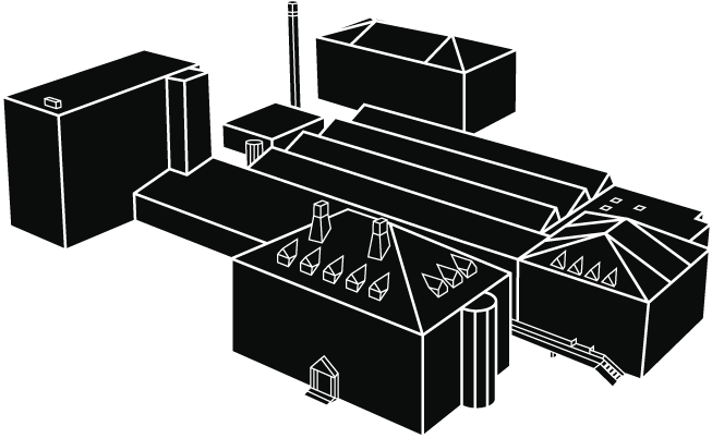
The set of data I focused on refers to my university campus, or rather its students. Where do they come from? How old are they? Are there big differences between semesters or genders? My journey began with all these questions in mind and endless charts of raw data. I started with basic visualizations like circles and bar graphs in an attempt of getting an overview. Later, they evolved into graphics with greater precision and increased validity.
DATA VISUALISATION
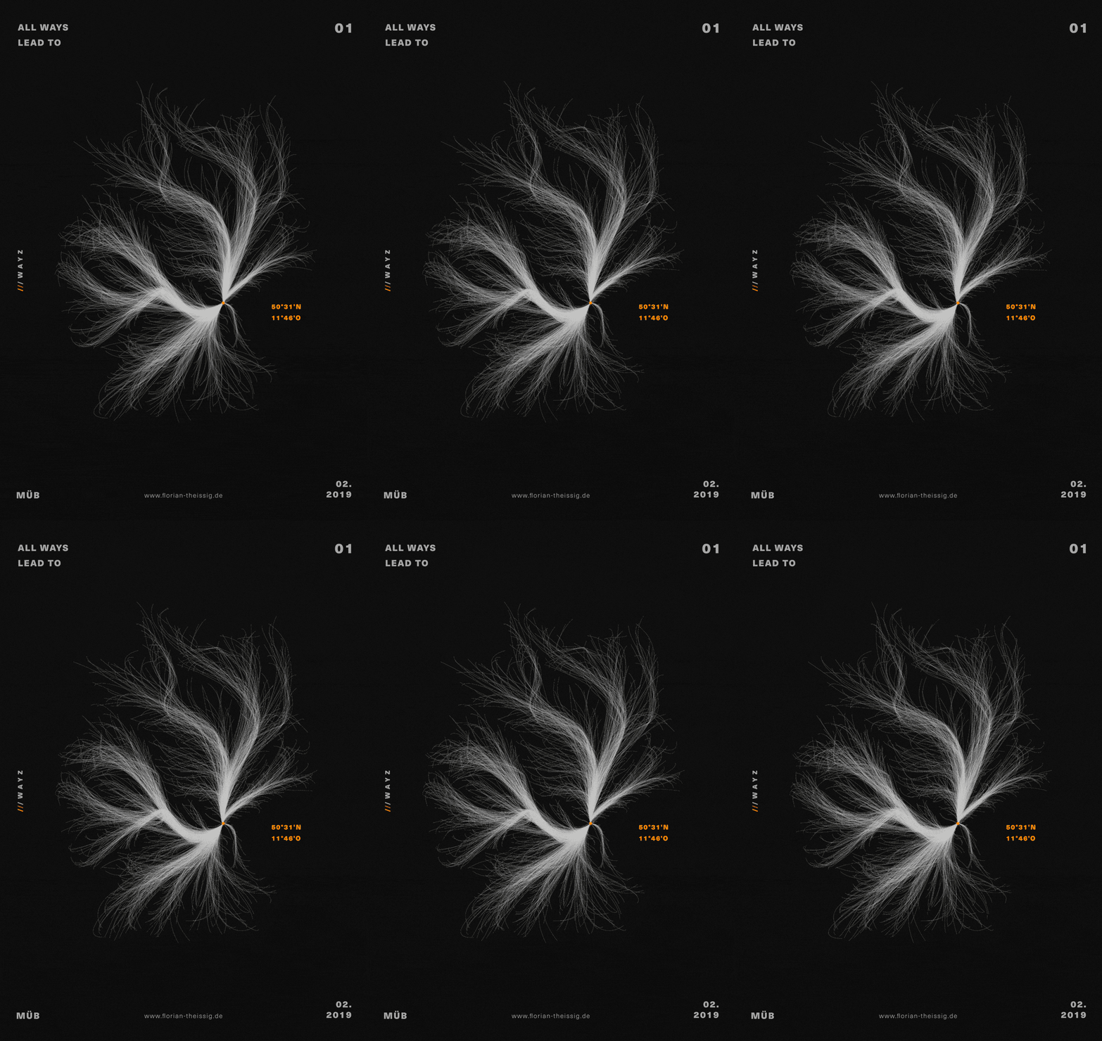
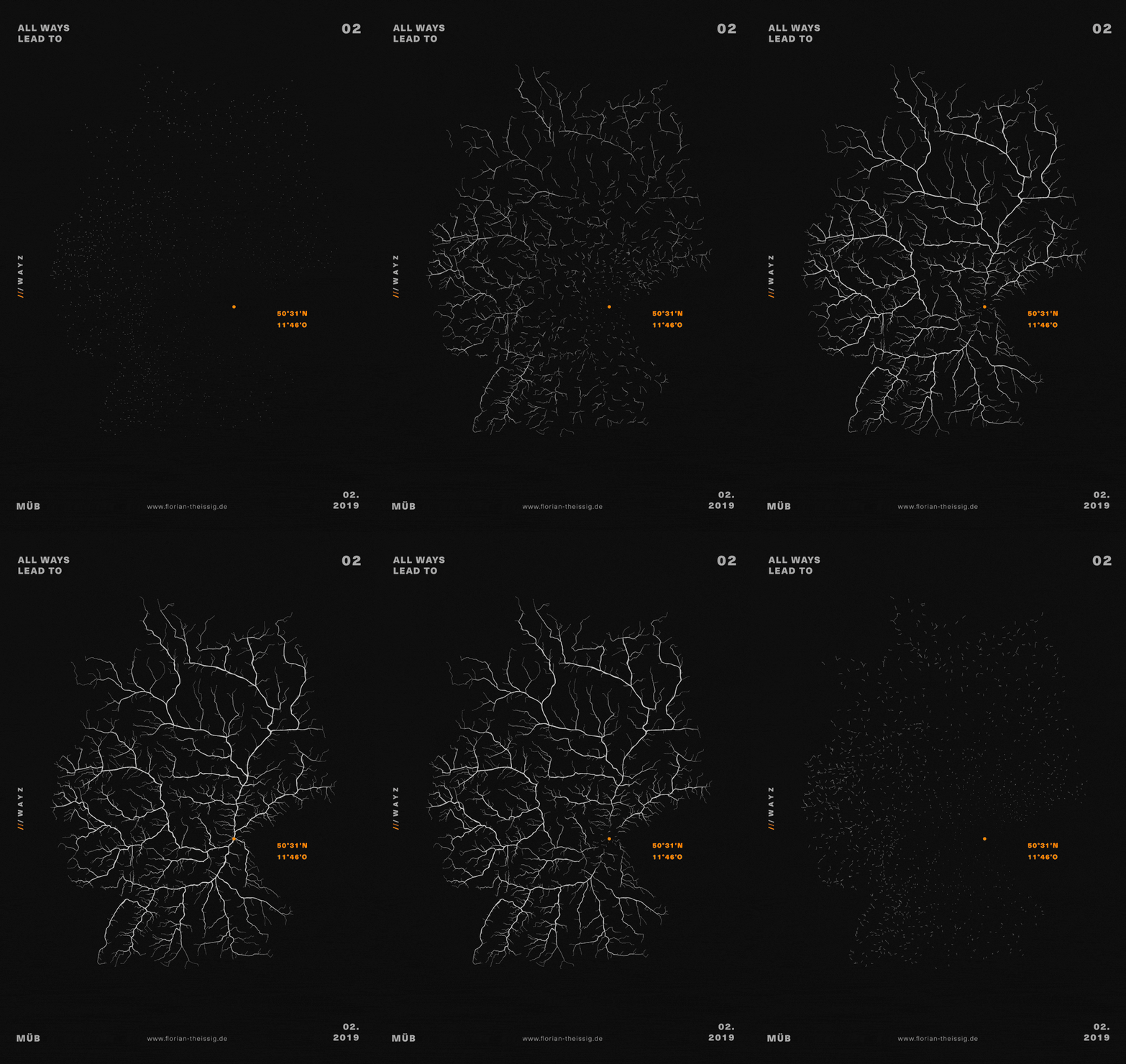
To give you an example: I was looking for a way to visualize where the students of my university came from, without including extraneous information. In order to solve this problem I programmed a road map, which only showed the route from all German cities to my university. This visualization led to a reduced and more appealing design that only highlighted the relevant data.
VR
In the end, all my graphics and visualizations lead into one virtual world, which gets accessible via virtual reality glasses. In this case, it is the "Oculus Go". Unfortunately, you need these glasses to access the original, spatial data world. Invite me, and I will bring my own device for the purpose of presentation. I also decided to provide a small web VR demo, in order to give you an impression of what this world looks like. Enjoy.
SCROLL DOWN
WHAT
IT'S ALL
ABOUT?
VIRTUAL REALITY &
INFORMATIONDESIGN
“Campus Bachelor” is the name of my bachelor‘s thesis in media design, or more precisely, information design. Everyday we are surrounded by an almost unlimited amount of data. The task of media designers like me is to make these facts and figures comprehensible for everybody. Therefore, we use different visualizations and tools like VR glasses. In the process, not only the transmittance of information is improved, but there are also new interrelations that become visible.
HOCHSCHULE
HOF
The set of data I focused on refers to my university campus, or rather its students. Where do they come from? How old are they? Are there big differences between semesters or genders? My journey began with all these questions in mind and endless charts of raw data. I started with basic visualizations like circles and bar graphs in an attempt of getting an overview. Later, they evolved into graphics with greater precision and increased validity.
DATA
VISUALISATION
To give you an example: I was looking for a way to visualize where the students of my university came from, without including extraneous information. In order to solve this problem I programmed a road map, which only showed the route from all German cities to my university. This visualization led to a reduced and more appealing design that only highlighted the relevant data.
VR
In the end, all my graphics and visualizations lead into one virtual world, which gets accessible via virtual reality glasses. In this case, it is the "Oculus Go". Unfortunately, you need these glasses to access the original, spatial data world. Invite me, and I will bring my own device for the purpose of presentation. I also decided to provide a small web VR demo, in order to give you an impression of what this world looks like. Enjoy.